Your SaaS Blog Is One Update Away From Irrelevance
ClickUp lost 97.6% of its blog traffic in 15 months. From 1.19 million monthly organic visits in January 2025 to under 29,000 by April 2026. This was not a penalty. There was no manual action. The domain itself held relatively steady, declining only 57.8% over the same period. Google did not punish the brand. It […]
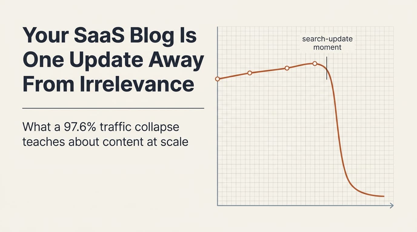
ClickUp lost 97.6% of its blog traffic in 15 months. From 1.19 million monthly organic visits in January 2025 to under 29,000 by April 2026.
This was not a penalty. There was no manual action. The domain itself held relatively steady, declining only 57.8% over the same period. Google did not punish the brand. It punished the blog, specifically.
ClickUp’s response made it worse. They published 2,815 new posts using the same approach that triggered the decline. They removed 42. Every Google update after the initial hit compounded the damage. There was exactly one month of partial recovery in the entire fifteen months.
If your B2B SaaS company produces content at scale, this is a preview of what happens when content strategy optimizes for the wrong thing.
The pattern that killed the blog

The failure pattern is structural, not cosmetic.
ClickUp’s blog followed a playbook that will look familiar to anyone who has worked in SaaS marketing. Listicles targeting high-volume keywords. The company’s own product positioned at number one in every list. Competitor coverage kept to a minimum. Promotional elements woven throughout the content.
On any single page, this approach is unremarkable. Across 7,000 pages, it becomes a pattern that Google’s systems can detect.
Here is what the pattern looked like in practice.
Every listicle placed ClickUp’s product first, with four to seven times more space than any competitor. ClickUp’s limitations were always described in two vague sentences. Competitors received specific, actionable criticisms. The structure was identical across thousands of pages: features, best for, limitations, pricing, rating. The same skeleton, repeated without variation.
Promotional density averaged one commercial element per 250 to 400 words. Signup buttons, product screenshots used as selling points, pricing tables, embedded videos, trial offers. Before the reader could get to the information they searched for, they had to scroll past multiple calls to action.
Lists were padded to justify self-placement. One page listing alternatives to a popular AI tool included 20 entries. An SEO content optimizer, an AI detection bypass tool, and an academic research platform were listed alongside actual alternatives. The honest answer to the query was eight tools. The padded answer served the company’s ranking goals, not the reader’s question.
Why the core topics died too
The common explanation on LinkedIn was topical overreach. ClickUp ranked for keywords far outside its product category, and Google supposedly punished it for straying beyond its lane.
That explanation is partially true. The company did rank for motivational quotes, resume templates, and travel itineraries that had nothing to do with project management. Losing those rankings was expected.
But the core topics died at the same rate. ClickUp’s exact product category keyword went from a top-ten ranking to position 33. Its primary commercial keyword dropped to one visit per month. Meeting agenda templates, SOP templates, content calendar templates, all legitimate workflow topics that sit squarely within the product’s scope, were destroyed.
If topical authority were the only factor, core keywords would have held. They did not. The quality signal contaminated everything.
The Zapier control group

The same model behaves differently when editorial trust is preserved.
This is where the analysis gets useful for anyone building a content strategy.
Zapier runs the same model. SaaS company with a massive blog covering topics well beyond its core product. Workflow automation, AI tools, productivity apps, CRM, email marketing. They write about everything, just like ClickUp.
Over the same fifteen months, Zapier declined 53% from its peak. A real decline, partly driven by AI tools cannibalizing informational queries across the board. But Zapier stabilized at 4.6 million monthly visits, still one of the largest SaaS blogs on the internet.
ClickUp lost 97.6%. They run the same model. The variable is execution.
Zapier lists eight tools in its alternatives posts, all genuine alternatives with honest assessments. It places its own product at positions three and seven, not number one. Its editorial voice is real. It includes current tools. It closes with value, not a signup prompt.
The project management company lists twenty tools, pads the list with irrelevant entries, places itself first with four times the space, uses templated descriptions with no editorial voice, includes outdated tools, and closes with a signup CTA.
Both companies promote their products. Both run commercial CTAs. The difference is whether the promotion degrades the content.
Backlinks do not fix this
During the exact period ClickUp’s blog lost 97.6% of its traffic, its domain metrics went up. Referring domains to the blog grew 28%. Domain Rating increased. ClickUp appears to have invested in legitimate link outreach as part of its recovery strategy.
Traffic still cratered.
This permanently challenges the assumption that more backlinks equal more traffic. When the content quality signal is the problem, building links treats a symptom that does not exist. Every dollar spent on link building during a Helpful Content classifier event is a dollar that should have gone to content pruning and quality improvement.
The compounding error

Publishing more of the failing pattern compounds the classifier signal.
The most damaging decision was the response to the initial decline.
The first major hit took ClickUp’s blog from 1.19 million to 492,000 visits. A significant drop, but still a substantial traffic base to work with. The correct response was to freeze publishing, audit the bottom-performing content, prune pages that matched the failure pattern, rebuild a small set of pages with quality improvements, and monitor for thirty days before resuming.
Instead, ClickUp published 2,815 new posts in fifteen months. A 67% increase in total blog content. The new content followed the same promotional template. The same listicle structure. The same self-placement pattern.
Each batch of new templated content gave Google’s systems more data confirming the quality signal. The second update hit harder than the first. The third harder than the second. Fifteen months of doubling down took 492,000 to 29,000.
Scaling content that triggered a classifier does not dilute the problem. It compounds it.
What actually works at scale
Zapier proves that you can cover topics far outside your core product, include your own product in listicles, run promotional CTAs, and publish at massive scale while maintaining organic traffic. The deciding factor is whether the promotion degrades the content.
For anyone building a content engine for a B2B SaaS company, the principles are straightforward.
Place your product where it honestly belongs. If it is the best answer for a given query, it can rank first. But it must receive the same editorial treatment as every competitor. Same word count. Same depth of limitations. Same tone.
Vary your content structure. When thousands of pages follow an identical skeleton, pattern recognition detects it. Different query types deserve different content formats. A thorough breakdown of five tools is different from a quick comparison of fifteen. A “how to choose” guide should read differently from a “best tools for X” list, which should read differently from a product comparison. If every page on your blog could be generated by swapping out product names in a single template, the content has a structural monoculture problem. Zapier avoids this. Its comparison posts use different layouts, different section orders, and different levels of depth depending on how complex the category is.
Start with the query, not the product. The first 300 words of any page should answer the question the reader actually searched for. No product pitch, no signup prompt, no company history. The reader came with a specific problem. Earn their trust by solving it before introducing any commercial element. Pages that lead with value and delay the pitch consistently outperform pages that open with promotion, because the reader stays long enough to see the rest of the content. Bounce rate is a signal. If 70% of visitors leave within ten seconds because the page reads like a brochure, that page teaches Google something about your entire blog.
Respond to decline by pruning, not publishing. If organic traffic drops more than 20% over three months, the first response is to audit and cut, not to produce more content using the approach that caused the decline.
Maintain your technical foundation. Broken schema markup, unresolved template variables, and unsourced claims are individually small issues. Across thousands of pages, they compound into a signal of automated, low-quality content.
The recovery window problem
The data shows one month of partial recovery in fifteen months. Once a Helpful Content classifier is applied at the section level, recovery is not a matter of publishing better content. It requires a fundamental restructuring of the content approach, a significant pruning of the existing library, and sustained quality improvements over multiple update cycles.
Prevention is the only viable strategy. By the time traffic decline is visible, the compounding damage is six to twelve months deep.
If you produce content at scale for a B2B SaaS company, audit your content against these patterns now. Not after the next core update. The window between the pattern forming and the classifier applying is the only window you have.
This analysis builds on Kamila Olexa’s investigation into ClickUp’s traffic decline, originally published at ContentLevers. Her research included sitemap crawls from December 2024 through April 2026, Wayback Machine page-version comparisons, and detailed SERP analysis. If you want the full forensic breakdown with page-level data, read her piece. This article focuses on the systemic patterns and what they mean for anyone building content at scale.
Enjoying this essay?
Written by

Elom
GTM, growth, and revenue systems operator with 12 years across Fortune 500s, fintech, and B2B startups. Building at the intersection of AI, data, demand, and revenue.
Get the next deep-dive in your inbox
Essays on demand creation, GTM, growth engineering, and revenue systems. Free.


